点击查看更新记录
更新记录
2022-03-21:调整偏移量
- 调整偏移量和间隔宽度,确保没有侧栏电子钟的用户布局正常。
- 调整顶部突起侧移量。尽量无缝接合。
2021-12-13:调整样式强调级
- 修改几个不规范的!important,兼容fixed_card_widget。
- 联动教程: 基于Butterfly的手机端fixed定位侧栏布局魔改方案
2021-08-02:作者卡片UI改造另起一帖
- 作者卡片UI改造为游戏角色属性面板
- 魔改方案已迁至新帖:SAO-UI-PLAN—Card-Player
2021-07-30:初步实现UI
- 使用伪类实现UI改造
- 新增几条修复补丁样式
- 无魔改源码,纯CSS实现侧栏风格美化
2021-07-29:初步实现UI
- 实现UI风格Demo
点击查看参考教程
| 参考方向 | 教程原贴 |
|---|---|
| 样式风格参考,图标、音效资源采集 | SAO Utils |
| CSS transform 属性 | CSS transform 属性 |
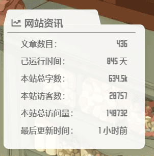
预览效果
开发历程
因为是SAO UI PLAN中可以说唯一的纯css项目毕竟总共也就写了三个UI,所以做的进度非常的快。而且原理也非常的简单。
前期尝试是通过对几个空div做变形,再通过盒子模型做位移来达到期望的梯形突起标签效果。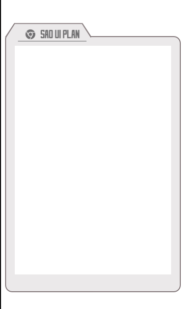
- 用到的css
1
2
3
4
5
6
7
8
9
10
11
12
13
14
15
16
17
18
19
20
21
22
23
24
25
26
27
28
29
30
31
32
33
34
35
36
37
38
39
40
41
42
43
44
45
46
47
48
49
50
51
52
53
54
55
56
57
58
59
60
61
62
63
64
65
66
67
68
69
70
71
72
73
74
75
76
77
78
79
80
81
82
83
84
85
86
87
88
89
90
91
92@font-face{
font-family: 'SAOUI';
src: url('https://npm.elemecdn.com/akilar-candyassets/fonts/SAOUI.ttf');
font-display: swap;
}
#div1 {
position: relative;/*必须,为了梯形定位*/
width: 341px;
height: 500px;
background: #ebe9ea;
margin-top: 100px;
border: 2px solid #877c7e;
border-bottom-left-radius: 14px;
border-bottom-right-radius: 14px;
border-top-right-radius: 14px;
border-top-left-radius: 5px;
}
.trapezoidMaxLine {/*最外层梯形所在的div*/
position: absolute;/*相对于div1定位*/
/* background: #062343;/*设置成背景色,遮挡下边框*/ */
z-index: 4;
height: 27px;/*根据实际情况*/
width: 150px;/*根据实际情况*/
top: -29px;/*定位,根据实际情况*/
left: 8px;
}
/*重点来啦!!!最外层梯形代码在此*/
.trapezoidMaxLine:before {
content: '';
position: absolute;/*相对于trapezoidMaxLine定位*/
top: 0;
right: 0;
bottom: 0;
left: 0;
z-index: -1;
border: 2px solid #877c7e;
border-bottom: 0 solid #fff;
transform: perspective(6px) rotateX(3deg);
}
/*内层梯形所在的div,和最外层的一样,区别是定位参照物,和颜色位置*/
.trapezoidMinLine {/*内层梯形所在的div*/
position: absolute;
z-index: 4;
height: 27px;
width: 148px;
top: 1px;
left: 1px;
}
.trapezoidMinLine:before {
content: '';
position: absolute;
top: 0;
right: 0;
bottom: 0;
left: 0;
z-index: -1;
background: #ebe9ea;
border: 1px solid #877c7e;
border-bottom: 0 solid #fff;
transform: perspective(6px) rotateX(3deg);
}
span.unitName.titleText {
font-family: 'SAOUI';
font-size: 20px;
font-weight: bolder;
color: rgba(60, 60, 61,0.7);
top: 10px;
position: absolute;
z-index: 5;
left: 30px;
width: 100%;
}
span.unitName.titleText i{
margin-right: 10px;
}
span.unitName.titleText::after{
display: block;
width: 90%;
margin-left: -10%;
margin-top: 2px;
height: 2px;
content: '';
background: rgba(160, 159, 160,0.9);
border-radius: 5px;
}
#userVisitEchart{
background: #fff;
height: 90%;
width: 90%;
margin: 5% 5%;
} - 用到的html
1
2
3
4
5
6
7
8
9
10<link rel="stylesheet" href="style.css">
<link rel="stylesheet" href="https://npm.elemecdn.com/@fortawesome/fontawesome-free/css/all.min.css">
<div id="div1"><!-- 整个div -->
<div class="trapezoidMaxLine leftDistance"><!-- 最外层梯形 -->
<div class="trapezoidMinLine"></div><!-- 内层梯形 -->
<span class="unitName titleText"><i class="fab fa-chrome"></i>SAO UI PLAN</span>
</div>
<div id="userVisitEchart"></div><!-- 柱状图 -->
</div>
此处灵活运用了css的transform属性中的rotateX形变,也就是沿着X轴的3D旋转。
但是在实装到主题的过程中,遇到了一点阻力。因为写UI的时候是用的空div,想要照搬的话,就需要魔改源码。这种高耦合的做法很不适合最终将其插件化的目的,所以,我尝试使用伪类来实现。
效果还算理想。一开始使用的是侧栏卡片外框的伪类,后来发现这样会给没有标题的侧栏也添加一个梯形突起,所以很迅速的换到了标题栏所在的div里。代价则是,伪类定位需要判断的情况更复杂了,而且手机端和电脑端的效果有微妙的不同,猜测是分辨率以及我滥用百分比作为适配单位的关系。
最后造成的情况就是,虽然可以实现UI的变动,但是css属性的可移植性极差,没法适配任何人的主题,只能作为原理帖来简述。如果是其他人要使用的话,要自己根据主题进行微调。这部分主要体现在便签微妙的偏移量上。
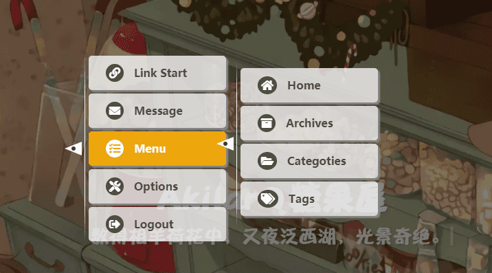
侧栏卡片UI重写
SAO UI PLAN 相关项目为本站原创项目,因此均为内测版,在样式适配上仅针对本站进行调整,因此在泛用性上存在缺漏。对于可能遇到的bug,欢迎在评论区进行讨论。
在进行本帖的魔改前,请务必做好备份以便回退。
- 唯一需要做的事情就是添加一个CSS。在
[Blogroot]\themes\butterfly\source\css\custom.css中添加如下内容。1
2
3
4
5
6
7
8
9
10
11
12
13
14
15
16
17
18
19
20
21
22
23
24
25
26
27
28
29
30
31
32
33
34
35
36
37
38
39
40
41
42
43
44
45
46
47
48
49
50
51
52
53
54
55
56
57
58
59
60
61
62
63
64
65
66
67
68
69
70
71
72
73
74
75
76
77
78
79
80
81
82
83
84
85
86
87
88
89
90
91
92
93
94
95
96
97
98
99
100
101
102
103
104/* SAOUI字体精简包,仅73KB */
@font-face{
font-family: 'SAOUI';
src: url('https://npm.elemecdn.com/akilar-candyassets/fonts/SAOUI.ttf');
font-display: swap;
}
/* 应用于除了作者卡片以为的所有侧栏卡片 */
.card-widget:not(.card-info) {
overflow: visible ;
margin-top: 45px ;
border-bottom-left-radius: 10px;
border-bottom-right-radius: 10px;
border-top-right-radius: 10px;
border-top-left-radius: 0px ;
font-family: 'SAOUI';
color: rgba(60,60,61,0.7);
font-weight: bold;
}
/* 修复一下对侧栏电子钟的覆盖 */
.card-widget.card-clock {
overflow: hidden ;
border-radius: 8px ;
margin-top: 0px ;
}
/* 定义标题栏的定位方式为绝对定位 */
.item-headline {
font-family: 'SAOUI';
color: rgba(60,60,61,0.7);
font-weight: bold;
position: absolute;
z-index: 4;
height: 27px;
width: 65%;
top: -27px;
left: 7px;
}
/* 标题栏下各元素的层级,保证它们能显示在伪类之上 */
.item-headline i {
position: relative;
top: 0px;
margin-left: 5%;
z-index: 2;
}
.item-headline span {
position: relative;
top: 0px;
z-index: 2;
}
.item-headline a {
position: relative;
top: 0px;
z-index: 2;
}
/* 梯形伪类 */
.item-headline:after {
content: '';
position: absolute;
top: -3px; /*卡片顶部突起上下偏移量*/
right: 0;
bottom: 0;
left: -3px; /*卡片顶部突起左右偏移量*/
z-index: 1;
background: rgba(255,255,255,0.9);
border: 1px solid rgba(255,255,255,0.9);
border-bottom: 0 solid #fff;
/* 关键形变 */
transform: perspective(20px) rotateX(3deg);
border-top-right-radius: 5px ;
border-top-left-radius: 5px ;
}
/* 下划线伪类 */
.item-headline:before {
display: block;
width: 140%;
margin-top: 2px;
height: 2px;
content: '';
background: rgba(160,159,160,0.9);
border-radius: 5px;
top: 40px;
left: 0;
position: relative;
}
/* 针对手机样式的偏移量调整 */
@media screen and (max-width: 800px) {
.item-headline {
left: 8px;
}
}
/* 夜间模式色彩适配,此处仅代表糖果屋夜间模式配色 */
[data-theme="dark"] .card-widget:not(.card-info) {
color: rgba(255,255,255,0.7) ;
}
[data-theme="dark"] .item-headline {
color: rgba(255,255,255,0.7) ;
}
[data-theme="dark"] .item-headline:after {
background: rgba(0,0,0,0.5);
border: 1px solid rgba(0,0,0,0.5);
border-bottom: 0 solid rgba(0,0,0,0.5);
}
[data-theme="dark"] .item-headline:before {
background: rgba(255,255,255,0.9);
} - 然后在
[Blogroot]\_config.butterfly.yml中引入即可。1
2
3inject:
head:
- <link rel="stylesheet" href="/css/custom.css" media="defer" onload="this.media='all'">侧栏作者卡片样式重构
预期计划是尽可能保留现有的作者卡片元素,但是会完全重写dom结构。配置项则不做改动。尽可能将改动压缩在一个pug文件和一个styl文件里。以便将来可以将其制作成侧栏插件。方案内容非高耦合,可另做讨论,存在插件化可行性。已迁至新帖:SAO-UI-PLAN—Card-Player
重写作者卡片UI,改成游戏角色属性面板
常规显示头像,鼠标悬停翻转显示人物属性卡片
常规显示站点描述,鼠标悬停翻转显示social icon
点击头像,持续显示站点描述(废案)
TO DO
侧栏卡片UI改造’
使用伪类实现UI改造
Use this card to join the candyhome and participate in a pleasant discussion together .
Welcome to Akilar's candyhome,wish you a nice day .