点击查看更新记录
点击查看参考教程
| 参考方向 | 教程原贴 |
|---|---|
| 本帖的卡片原设为贰猹提供 | 贰猹の小窝 |
| Flex布局参数解释 | Flex 布局教程:语法篇 - 阮一峰的网络日志 |
| Transition属性实现平滑过渡动画 | CSS3实现伪类hover离开时平滑过渡效果示例 |
| 使用clip-path实现多边形剪裁。 | 不可思议的CSS之clip-path |
| 参考渐变遮罩层的实现方式 | MDN-WEB-DOCS |
店长的碎碎念
嗨,哆摩,这里是Akilar嘚嘶。
呀,说起来我真的是很久很久没有更新了啊,最近几个月有点低气压,没啥干劲,就想着这个季度干完就离职转行。博客也是炒冷饭,巴特福来都更新了好几版了,我还懒得维护旧版教程。因为jerry太流氓了嘛,总是冷不丁的连文件名称都改了。要维护的话就要连着改上30几篇,想想就是稍微动动脑筋就能猜到的事情,我觉得聪明的读者肯定是会自己思考出来的。所以,摆烂啦。旧版不去维护了。
然后贰猹就不干了啊,今年四月份我就说要按照新思路写个首页卡片了,然后一直拖一直拖,一直拖一直拖,咕咕咕可耻但是很爽。
咕着咕着就出事情了。最近加群回答突然就出现了anzhiy.cn的答案。鱼鱼算是冰糖红茶的铁粉了,而且他学的很快也有教学热情,然后他就把他的心得和教程录成视频。
然后捏,加群回答就变成anzhiy.cn了。
怨念超大啊喂,以前我给冰老师售后的时候,加群回答全是zfe.space,现在鱼鱼给我售后的时候,加群回答全部是anzhiy.cn。明明是三个人的电影,我却始终不能,留姓名🎵🎵🎵。坏了,我成替身了。😱😱😱
再不发几篇新东西你们怕是要把我忘了。
所以,铛铛铛,新版双栏卡片就新鲜出炉啦,虽然设计是笨蛋贰猹的创意,但是笨蛋贰猹自己写不出来还要吐槽我实现的效果。我要再敲一个笨蛋贰猹,因为重要的事情要说三遍。好老的梗。
不管了,我单方面宣布,巴特福来最好看的双栏布局方案,今天起跟我姓啦!
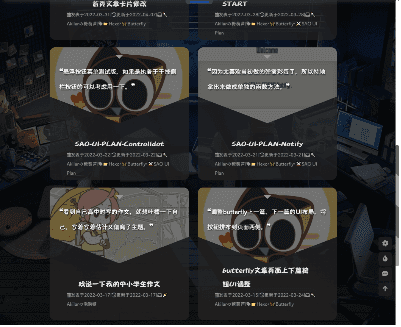
效果预览
点击查看预览效果


魔改步骤
- 修改
[Blogroot]\themes\butterfly\layout\includes\mixins\post-ui.pug,整个替换为下面的代码:1
2
3
4
5
6
7
8
9
10
11
12
13
14
15
16
17
18
19
20
21
22
23
24
25
26
27
28
29
30
31
32
33
34
35
36
37
38
39
40
41
42
43
44
45
46
47
48
49
50
51
52
53
54
55
56
57
58
59
60
61
62
63
64
65
66
67
68
69
70
71
72
73
74
75
76
77
78
79
80
81
82
83
84
85
86
87
88
89
90
91
92
93
94
95
96
97
98
99
100
101
102
103
104
105
106
107
108
109
110
111
112
113
114
115
116
117
118
119
120
121
122
123
124
125
126
127
128
129
130
131
132
133
134
135mixin postUI(posts)
each article , index in page.posts.data
.recent-post-item
-
let link = article.link || article.path
let title = article.title || _p('no_title')
const position = theme.cover.position
let leftOrRight = position === 'both'
? index%2 == 0 ? 'left' : 'right'
: position === 'left' ? 'left' : 'right'
let post_cover = article.cover
let no_cover = article.cover === false || !theme.cover.index_enable ? 'no-cover' : ''
-
.recent-post-content(class=leftOrRight)
.recent-post-cover-shadow
.recent-post-cover
img.article-cover(src=url_for(post_cover) onerror=`this.onerror=null;this.src='`+ url_for(theme.error_img.post_page) + `'` alt=title)
.recent-post-info
a.article-title(href=url_for(link) title=title)
.article-title-link= title
.recent-post-meta
.article-meta-wrap
if (is_home() && (article.top || article.sticky > 0))
span.article-meta
i.fas.fa-thumbtack.sticky
span.sticky= _p('sticky')
span.article-meta-separator |
if (theme.post_meta.page.date_type)
span.post-meta-date
if (theme.post_meta.page.date_type === 'both')
i.far.fa-calendar-alt
span.article-meta-label=_p('post.created')
time.post-meta-date-created(datetime=date_xml(article.date) title=_p('post.created') + ' ' + full_date(article.date))=date(article.date, config.date_format)
span.article-meta-separator |
i.fas.fa-history
span.article-meta-label=_p('post.updated')
time.post-meta-date-updated(datetime=date_xml(article.updated) title=_p('post.updated') + ' ' + full_date(article.updated))=date(article.updated, config.date_format)
else
- let data_type_updated = theme.post_meta.page.date_type === 'updated'
- let date_type = data_type_updated ? 'updated' : 'date'
- let date_icon = data_type_updated ? 'fas fa-history' :'far fa-calendar-alt'
- let date_title = data_type_updated ? _p('post.updated') : _p('post.created')
i(class=date_icon)
span.article-meta-label=date_title
time(datetime=date_xml(article[date_type]) title=date_title + ' ' + full_date(article[date_type]))=date(article[date_type], config.date_format)
if (theme.post_meta.page.categories && article.categories.data.length > 0)
span.article-meta
span.article-meta-separator |
i.fas.fa-inbox
each item, index in article.categories.data
a(href=url_for(item.path)).article-meta__categories #[=item.name]
if (index < article.categories.data.length - 1)
i.fas.fa-angle-right.article-meta-link
if (theme.post_meta.page.tags && article.tags.data.length > 0)
span.article-meta.tags
span.article-meta-separator |
i.fas.fa-tag
each item, index in article.tags.data
a(href=url_for(item.path)).article-meta__tags #[=item.name]
if (index < article.tags.data.length - 1)
span.article-meta-link #[='•']
mixin countBlockInIndex
- needLoadCountJs = true
span.article-meta
span.article-meta-separator |
i.fas.fa-comments
if block
block
span.article-meta-label= ' ' + _p('card_post_count')
if theme.comments.card_post_count
case theme.comments.use[0]
when 'Disqus'
+countBlockInIndex
a(href=full_url_for(link) + '#disqus_thread')
i.fa-solid.fa-spinner.fa-spin
when 'Disqusjs'
+countBlockInIndex
a(href=full_url_for(link) + '#disqusjs')
span.disqus-comment-count(data-disqus-url=full_url_for(link))
i.fa-solid.fa-spinner.fa-spin
when 'Valine'
+countBlockInIndex
a(href=url_for(link) + '#post-comment')
span.valine-comment-count(data-xid=url_for(link))
i.fa-solid.fa-spinner.fa-spin
when 'Waline'
+countBlockInIndex
a(href=url_for(link) + '#post-comment')
span.waline-comment-count(id=url_for(link))
i.fa-solid.fa-spinner.fa-spin
when 'Twikoo'
+countBlockInIndex
a.twikoo-count(href=url_for(link) + '#post-comment')
i.fa-solid.fa-spinner.fa-spin
when 'Facebook Comments'
+countBlockInIndex
a(href=url_for(link) + '#post-comment')
span.fb-comments-count(data-href=urlNoIndex(article.permalink))
when 'Remark42'
+countBlockInIndex
a(href=url_for(link) + '#post-comment')
span.remark42__counter(data-url=urlNoIndex(article.permalink))
i.fa-solid.fa-spinner.fa-spin
when 'Artalk'
+countBlockInIndex
a(href=url_for(link) + '#post-comment')
span.artalk-count(data-page-key=url_for(link))
i.fa-solid.fa-spinner.fa-spin
a.article-content(href=url_for(link) title=title)
//- Display the article introduction on homepage
case theme.index_post_content.method
when false
- break
when 1
.article-content-text!= article.description
when 2
if article.description
.article-content-text!= article.description
else
- const content = strip_html(article.content)
- let expert = content.substring(0, theme.index_post_content.length)
- content.length > theme.index_post_content.length ? expert += ' ...' : ''
.article-content-text!= expert
default
- const content = strip_html(article.content)
- let expert = content.substring(0, theme.index_post_content.length)
- content.length > theme.index_post_content.length ? expert += ' ...' : ''
.article-content-text!= expert
.recent-post-arrow
if theme.ad && theme.ad.index
if (index + 1) % 3 == 0
.recent-post-item.ads-wrap!=theme.ad.index - 样式方案提供两种:
- 样式一:电脑端宽屏采用滑动卡片,平板宽度采用双栏布局,手机宽度采用单栏卡片。
- 样式二:移除滑动卡片,按屏幕宽度依次应用三栏、双栏、单栏。
读者可以根据自己的喜好挑选。
新建目录[Blogroot]\themes\butterfly\source\css\_index_card_style\,并在下面新建对应的文件。注意看牢短横杠哦,路径新建错误导致的问题本店概不负责。新建
[Blogroot]\themes\butterfly\source\css\_index_card_style\slidecard.styl,填入以下内容。1
2
3
4
5
6
7
8
9
10
11
12
13
14
15
16
17
18
19
20
21
22
23
24
25
26
27
28
29
30
31
32
33
34
35
36
37
38
39
40
41
42
43
44
45
46
47
48
49
50
51
52
53
54
55
56
57
58
59
60
61
62
63
64
65
66
67
68
69
70
71
72
73
74
75
76
77
78
79
80
81
82
83
84
85
86
87
88
89
90
91
92
93
94
95
96
97
98
99
100
101
102
103
104
105
106
107
108
109
110
111
112
113
114
115
116
117
118
119
120
121
122
123
124
125
126
127
128
129
130
131
132
133
134
135
136
137
138
139
140
141
142
143
144
145
146
147
148
149
150
151
152
153
154
155
156
157
158
159
160
161
162
163
164
165
166
167
168
169
170
171
172
173
174
175
176
177
178
179
180
181
182
183
184
185
186
187
188
189
190
191
192
193
194
195
196
197
198
199
200
201
202
203
204
205
206
207
208
209
210
211
212
213
214
215
216
217
218
219
220
221
222
223
224
225
226
227
228
229
230
231
232
233
234
235
236
237
238
239
240
241
242
243
244
245
246
247
248
249
250
251
252
253
254
255
256
257
258
259
260
261
262
263
264
265
266
267
268
269
270
271
272
273
274//default color:
:root
--recent-post-bgcolor: rgba(255, 255, 255, 0.9) //默认背景
--article-content-bgcolor: #49b1f5 //描述版块背景
--recent-post-arrow: #ffffff //箭头配色
--recent-post-cover-shadow: #ffffff //封面遮罩层配色,建议和默认值的颜色相对应。
--recent-post-transition: all 0.5s cubic-bezier(0.59, 0.01, 0.48, 1.17) //动画效果。不了解的不要改动
[data-theme="dark"]
--recent-post-bgcolor: rgba(35,35,35,0.5)
--article-content-bgcolor: #99999a
--recent-post-arrow: #37e2dd
--recent-post-cover-shadow: #232323
// 默认的首页卡片容器布局
.recent-posts
padding 0 15px 0 15px
height fit-content
.recent-post-item
margin-bottom 15px
width 100%
background var(--recent-post-bgcolor)
overflow hidden
border-radius 15px
.recent-post-content
display flex
background var(--recent-post-bgcolor)
position relative
.recent-post-cover
display flex
background transparent
.recent-post-info
display flex
background transparent
flex-direction column
justify-content center
align-items center
.article-title
height 50%
display: flex
text-align: center
align-items: center
justify-content: flex-end
flex-direction: column
.article-title-link
color: var(--text-highlight-color)
transition: all .2s ease-in-out
display: -webkit-box;
-webkit-box-orient: vertical;
overflow: hidden;
&:hover
color: $text-hover
.recent-post-meta
height 50%
display: flex
text-align: center
align-items: center
justify-content: flex-start
flex-direction: column
.article-meta-wrap
color #969797
display: -webkit-box;
-webkit-box-orient: vertical;
overflow: hidden;
a
color: var(--text-highlight-color)
transition: all .2s ease-in-out
color #969797
&:hover
color: $text-hover
.article-content
display flex
text-align: center
flex-direction row
align-items center
justify-content center
.article-content-text
display -webkit-box
-webkit-box-orient vertical
text-overflow: ellipsis
overflow hidden
color #fff
text-shadow 1px 2px 3px #000
&::before
content "❝"
font-size 20px
&::after
content "❞"
font-size 20px
&.ads-wrap
display: block
height: auto
// PC端滑动卡片样式
@media screen and (min-width:1069px)
.recent-posts
padding 0 15px 0 15px
.recent-post-item
.recent-post-content
position relative
height 200px
width 100%
transition var(--recent-post-transition)
&:hover
.recent-post-cover-shadow
width 10.1%
transition var(--recent-post-transition)
.recent-post-cover
width 10%
transition var(--recent-post-transition)
.article-content
width calc(30% + 80px)
transition var(--recent-post-transition)
.article-content-text
opacity 1
.recent-post-arrow
transition var(--recent-post-transition)
.recent-post-cover-shadow
z-index: 1
transition var(--recent-post-transition)
position: absolute
height 200px
width 40%
.recent-post-cover
height 200px
width 40%
transition var(--recent-post-transition)
img
height 100%
width 100%
object-fit cover
.recent-post-info
height 200px
width calc(60% - 80px)
.article-title
margin: 0px 40px
font-size 24px
.article-title-link
-webkit-line-clamp: 2;
.recent-post-meta
margin: 0px 20px
.article-meta-wrap
font-size 12px
-webkit-line-clamp: 3;
.article-content
height 200px
width 90px
background var(--article-content-bgcolor)
transition var(--recent-post-transition)
.article-content-text
-webkit-line-clamp 4
transition: var(--recent-post-transition)
opacity 0
.recent-post-arrow
transition var(--recent-post-transition)
display block
position absolute
height 20px
width 8px
background var(--recent-post-arrow)
&.both,
&.right
.recent-post-cover-shadow
left 0
background linear-gradient(to left, var(--recent-post-cover-shadow), transparent)
.recent-post-cover
order: 1
.recent-post-info
order: 2
.article-content
order: 3
clip-path polygon(0 50%, 80px 0, 100% 0, 100% 100%, 80px 100%)
.article-content-text
margin 20px 40px 20px 80px
.recent-post-arrow
order: 4
left calc(100% - 80px)
top calc(50% - 10px)
clip-path polygon(0 10px, 8px 0, 8px 20px)
&:hover
.recent-post-arrow
left calc(100% - 40px)
&.left
.recent-post-cover-shadow
right 0
background linear-gradient(to right, var(--recent-post-cover-shadow), transparent)
.recent-post-cover
order: 4
.recent-post-info
order: 3
.article-content
order: 2
clip-path polygon(100% 50%,calc(100% - 80px) 100%,0 100%,0 0,calc(100% - 80px) 0)
.article-content-text
margin 20px 80px 20px 40px
.recent-post-arrow
order: 1
left 72px
top calc(50% - 10px)
clip-path polygon(0 0, 8px 10px, 0 20px)
&:hover
.recent-post-arrow
left 32px
// 双栏布局卡片自适应适配
@media screen and (min-width:572px) and (max-width:1068px)
.recent-posts
padding 0 15px 0 15px
display flex
flex-direction row
flex-wrap wrap
.recent-post-item
border-radius 15px
overflow hidden
width 47%
margin 0px 3% 20px 0px
nav#pagination
width: 100%
// 手机端单栏布局自适应适配
@media screen and (max-width:572px)
.recent-posts
padding 0 15px 0 15px
.recent-post-item
border-radius 15px
overflow hidden
// 手机端及双栏卡片样式
@media screen and (max-width:1068px)
.recent-posts
.recent-post-item
.recent-post-content
flex-direction column
flex-wrap nowrap
align-items center
max-height 350px
height: auto
width 100%
.recent-post-cover
width 100%
height 200px
clip-path polygon(0 130px,0 0,100% 0,100% 130px,50% 100%)
img
height 200px
width 100%
object-fit cover
.recent-post-info
height 150px
width 100%
padding 0px 25px 5px 25px
.article-title
margin: 0px 40px
font-size 18px
.article-title-link
-webkit-line-clamp: 2;
.recent-post-meta
margin: 0px 20px
.article-meta-wrap
font-size 12px
-webkit-line-clamp: 3;
.article-content
position absolute
height 200px
width 100%
background rgba(25,25,25,0.5)
clip-path polygon(0 130px,0 0,100% 0,100% 130px,50% 100%)
.article-content-text
-webkit-line-clamp 3
font-size 16px
margin 0px 25px 30px 25px
.recent-post-arrow
display block
background var(--article-content-bgcolor)
position absolute
height 10px
width 20px
clip-path polygon(0 0,100% 0,50% 100%)
top 20px新建
[Blogroot]\themes\butterfly\source\css\_index_card_style\multicard.styl,填入以下内容。1
2
3
4
5
6
7
8
9
10
11
12
13
14
15
16
17
18
19
20
21
22
23
24
25
26
27
28
29
30
31
32
33
34
35
36
37
38
39
40
41
42
43
44
45
46
47
48
49
50
51
52
53
54
55
56
57
58
59
60
61
62
63
64
65
66
67
68
69
70
71
72
73
74
75
76
77
78
79
80
81
82
83
84
85
86
87
88
89
90
91
92
93
94
95
96
97
98
99
100
101
102
103
104
105
106
107
108
109
110
111
112
113
114
115
116
117
118
119
120
121
122
123
124
125
126
127
128
129
130
131
132
133
134
135
136
137
138
139
140
141
142
143
144
145
146
147
148
149
150
151
152
153
154
155
156
157
158
159
160
161
162
163
164
165
166
167
168
169
170
171
172
173
174//default color:
:root
--recent-post-bgcolor: rgba(200, 200, 200, 0.5) //默认背景
--article-content-bgcolor: #49b1f5 //描述版块背景
--recent-post-arrow: #ffffff //箭头配色
--recent-post-cover-shadow: #ffffff //封面遮罩层配色,建议和默认值的颜色相对应。
--recent-post-transition: all 0.5s cubic-bezier(0.59, 0.01, 0.48, 1.17) //动画效果。不了解的不要改动
[data-theme="dark"]
--recent-post-bgcolor: rgba(35,35,35,0.5)
--article-content-bgcolor: #99999a
--recent-post-arrow: #37e2dd
--recent-post-cover-shadow: #232323
// 默认的首页卡片容器布局
.recent-posts
padding 0 15px 0 15px
height fit-content
.recent-post-item
margin-bottom 15px
background var(--recent-post-bgcolor)
overflow hidden
border-radius 15px
.recent-post-content
display flex
background var(--recent-post-bgcolor)
position relative
.recent-post-cover
display flex
background transparent
.recent-post-info
display flex
background transparent
flex-direction column
justify-content center
align-items center
.article-title
height 50%
display: flex
text-align: center
align-items: center
justify-content: flex-end
flex-direction: column
.article-title-link
color: var(--text-highlight-color)
transition: all .2s ease-in-out
display: -webkit-box;
-webkit-box-orient: vertical;
overflow: hidden;
&:hover
color: $text-hover
.recent-post-meta
height 50%
display: flex
text-align: center
align-items: center
justify-content: flex-start
flex-direction: column
.article-meta-wrap
color #969797
display: -webkit-box;
-webkit-box-orient: vertical;
overflow: hidden;
a
color: var(--text-highlight-color)
transition: all .2s ease-in-out
color #969797
&:hover
color: $text-hover
.article-content
display flex
text-align: center
flex-direction row
align-items center
justify-content center
.article-content-text
display -webkit-box
-webkit-box-orient vertical
text-overflow: ellipsis
overflow hidden
color #fff
text-shadow 1px 2px 3px #000
&.ads-wrap
display: block
height: auto
nav#pagination
width: 100%
// 卡片单元布局样式
.recent-posts
padding 0 15px 0 15px
display flex
flex-direction row
flex-wrap wrap
.recent-post-item
border-radius 15px
overflow hidden
.recent-post-content
flex-direction column
flex-wrap nowrap
align-items center
max-height 350px
height: auto
width 100%
.recent-post-cover
width 100%
height 200px
clip-path polygon(0 130px,0 0,100% 0,100% 130px,50% 100%)
img
height 200px
width 100%
object-fit cover
.recent-post-info
height 150px
width 100%
padding 0px 25px 5px 25px
.article-title
margin: 0px 40px
font-size 18px
.article-title-link
-webkit-line-clamp: 2;
.recent-post-meta
margin: 0px 20px
.article-meta-wrap
font-size 12px
-webkit-line-clamp: 3;
.article-content
position absolute
height 200px
width 100%
background rgba(25,25,25,0.5)
clip-path polygon(0 130px,0 0,100% 0,100% 130px,50% 100%)
.article-content-text
-webkit-line-clamp 3
font-size 16px
margin 0px 25px 30px 25px
&::before
content "❝"
font-size 20px
&::after
content "❞"
font-size 20px
.recent-post-arrow
display block
background var(--article-content-bgcolor)
position absolute
height 10px
width 20px
clip-path polygon(0 0,100% 0,50% 100%)
top 20px
// 三栏布局滑动卡片样式
@media screen and (min-width:1069px)
.recent-posts
.recent-post-item
width 32.3%
margin 0px 1% 20px 0px
.recent-post-content
.recent-post-info
.article-title
margin: 0px 5px
.article-title-link
-webkit-line-clamp: 1;
.recent-post-meta
margin: 0px 5px
.article-meta-wrap
-webkit-line-clamp: 2;
// 双栏布局卡片自适应适配
@media screen and (min-width:572px) and (max-width:1068px)
.recent-posts
.recent-post-item
width 47%
margin 0px 3% 20px 0px
// 单栏布局卡片自适应适配
@media screen and (max-width:572px)
.recent-posts
.recent-post-item
width 100%
- 修改
[Blogroot]\themes\butterfly\source\css\_page\homepage.styl,将整文件内容替换为以下代码:1
2
3
4if hexo-config('index_card_style') == 'slidecard'
@import './_index_card_style/slidecard'
else if hexo-config('index_card_style') == 'multicard'
@import './_index_card_style/multicard' - 然后在主题配置文件
[Blogroot]\_config.butterfly.yml里新增配置项,这样我们就可以通过配置项自由切换使用哪款了:1
2
3# 主页卡片样式
# Docs: https://akilar.top/posts/d6b69c49/
index_card_style: slidecard # slidecard | multicard - 考虑到不管是样式一还是样式二都存在一个布局突变的情况。为了不至于让首页的文章出现空缺,建议将首页生成的文章数量控制为1,2,3的公倍数。修改站点配置文件
[Blogroot]\_config.yml。找到以下配置项进行调整,注意这是站点配置文件本就有的配置项,不是新增配置项。建议是调整为12篇。如果你的侧边栏魔改内容特别多,那么建议改成18、24、30。务必确保文章卡片栏比侧栏完全展开要长,这样展示效果最好。1
2
3
4
5
6
7
8# Home page setting
# path: Root path for your blogs index page. (default = '')
# per_page: Posts displayed per page. (0 = disable pagination)
# order_by: Posts order. (Order by date descending by default)
index_generator:
path: ''
per_page: 12
order_by: -date - 本教程讨论的卡片都是考虑有封面和有描述的。
话说追求无封面的极简主义者应该也不会用我的魔改吧所以需要保证你已经开启了相应的配置,查看主题配置文件[Blogroot]\_config.butterfly.yml,找到配置项开启描述栏。建议选择2模式。1
2
3
4
5
6
7
8# Display the article introduction on homepage
# 1: description
# 2: both (if the description exists, it will show description, or show the auto_excerpt)
# 3: auto_excerpt (default)
# false: do not show the article introduction
index_post_content:
method: 2
length: 500 # if you set method to 2 or 3, the length need to config

Use this card to join the candyhome and participate in a pleasant discussion together .
Welcome to Akilar's candyhome,wish you a nice day .