使用须知
本项目目前还是内测状态,样式优先考虑与本站的兼容,对于默认主题的兼容性适配暂时延后。一切以将本站装点完成为最优先事项。
我以前往侧栏按钮里丢过不少功能按钮,所以rightside.pug已经和原版不一样了,但是原理还是基本不变的。我会尽可能在文章里给出示例和声明一些必要的改动步骤。
源计划-方舟的魔改内容本就不是为零基础的小白设计的。所以没有前端基础的不要来使用,我也没有足够的精力来辅导。
点击查看更新记录
更新记录
2023-01-17:修复简繁转换文本丢失问题
- 换了一种实现方式
- 修复了简繁转换后,文本内容偏移的bug
2023-01-03:调整动效
- 调整电脑端弹簧刀样式旋转圆心。
- 文字内容添加动效。
2022-12-30:调整动效配色
- 电脑端按钮进行旋转调整,从弹簧刀得到的灵感。常态收起,避免遮挡过多侧栏。
- 手机端提供专属配色变量。
- 弃用原生样式。完全重写源文件。
2022-12-26:内测版
- 电脑端样式,异形切面
- 手机端样式,镶嵌圆形
点击查看参考教程
| 参考方向 | 教程原贴 |
|---|---|
| 参考了UI风格和配色样式 | Neon-Space-Rainmeter |
| 参考了UI风格和配色样式 | JARVIS-Highpitched-OS |
| fontawesome图标文档 | fontawesome |
| Flex布局参数解释 | Flex 布局教程:语法篇 - 阮一峰的网络日志 |
| Transition属性实现平滑过渡动画 | CSS3实现伪类hover离开时平滑过渡效果示例 |
| CSS伪类实现三角形绘制 | 纯CSS 实现绘制各种三角形(各种角度) - saucxs - 博客园 |
| 使用clip-path实现多边形剪裁。 | 不可思议的CSS之clip-path |
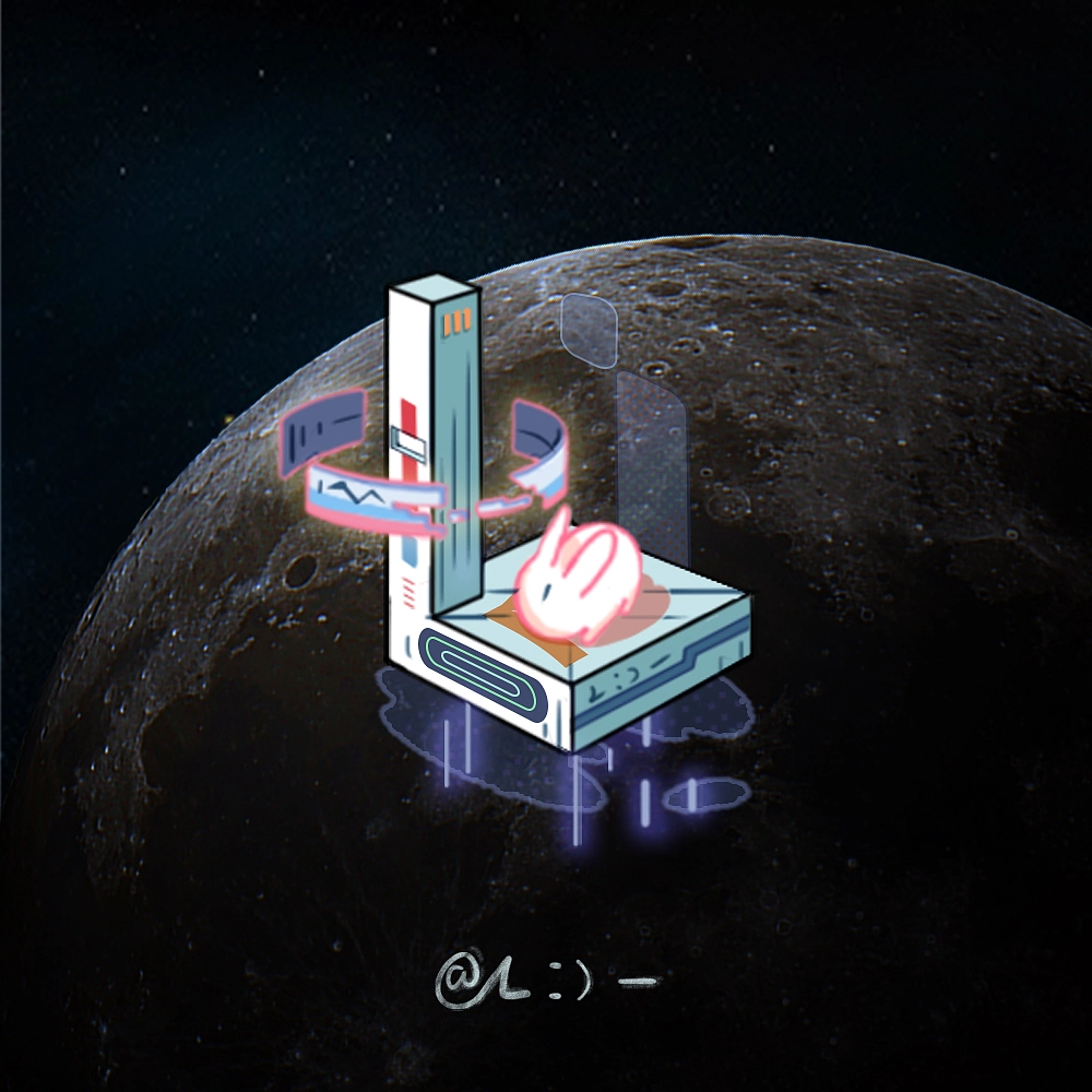
预览效果
点击查看预览效果

魔改步骤
- 重写
[Blogroot]\themes\butterfly\source\css\_layout\rightside.styl,直接用以下内容覆盖源文件。1
2
3
4
5
6
7
8
9
10
11
12
13
14
15
16
17
18
19
20
21
22
23
24
25
26
27
28
29
30
31
32
33
34
35
36
37
38
39
40
41
42
43
44
45
46
47
48
49
50
51
52
53
54
55
56
57
58
59
60
61
62
63
64
65
66
67
68
69
70
71
72
73
74
75
76
77
78
79
80
81
82
83
84
85
86
87
88
89
90
91
92
93
94
95
96
97
98
99
100
101
102
103
104
105
106
107
108
109
110
111
112
113
114
115
116
117
118
119
120
121
122
123
124
125
126
127
128
129
130
131
132
133
134
135
136
137
138
139
140
141
142
143
144
145
146
147
148
149
150
151
152
153
154
155
156
157
158
159
160
161
162
163
164
165
166
167
168
169
170
171
172
173
174
175
176
177
178
179
180
181
182
183
184
185
186
187
188
189
190
191
192
193
194
195
196
197
198
199
200
201
202
203
204
205
206
207
208
209
210
211
212
213
214
215
216
217
218
219
220
221
222
223:root
--rightside-background: rgba(14,14,14,0.95) //电脑端按钮背景底色
--rightside-background-hover: rgba(180, 50, 35, 0.95) //电脑端按钮悬停背景色
--rightside-font-color: #ffffff //电脑端按钮字体默认色
--rightside-box-shadow: #888888 //电脑端按钮内侧光晕效果
--rightside-icon-background: rgba(101, 103, 107,0.6) //电脑端按钮图标背景色
--rightside-icon-color: #ffffff //电脑端按钮图标颜色
--rightside-icon-shadow: #b6bac3 //电脑端按钮内侧光晕颜色
--rightside-corner-background: #c27314 //电脑端按钮角标背景颜色
--rightside-corner-color: #cdcdcd //电脑端按钮角标字体颜色
--rightside-corner-shadow: #222222 //电脑端按钮角标内侧光晕颜色
--rightside-m-background-color: #2e302f//手机端按钮背景底色
--rightside-m-border-color: #be7321 //手机端按钮外嵌边框
--rightside-m-icon-color: #ffffff//手机端按钮图标颜色
--rightside-m-icon-background: #707472//手机端图标背景颜色
--rightside-m-icon-border-color: #464a58//手机端图标边框颜色
--rightside-m-hover-color: #8c2c20//手机端悬停配色
--rightside-transition: all 0.5s cubic-bezier(0.59, 0.01, 0.48, 1.17) //按钮动态变化动画效果
[data-theme="dark"]
--rightside-background: rgba(35, 50, 68,0.75)
--rightside-background-hover: rgba(83, 65, 165, 0.95)
--rightside-font-color: #ffffff
--rightside-box-shadow: #888888
--rightside-icon-background: rgba(45, 45, 60,0.6)
--rightside-icon-color: #2983be
--rightside-icon-shadow: #2d342b
--rightside-corner-background: #2983be
--rightside-corner-color: #ffffff
--rightside-corner-shadow: #222222
--rightside-m-background-color: #2e302f//手机端按钮背景底色
--rightside-m-border-color: #2556ab //手机端按钮外嵌边框
--rightside-m-icon-color: #ffffff//手机端按钮图标颜色
--rightside-m-icon-background: #707472//手机端图标背景颜色
--rightside-m-icon-border-color: #141e29//手机端图标边框颜色
--rightside-m-hover-color: rgba(83, 65, 165, 0.95)//手机端悬停配色
//默认侧栏样式
#rightside
font-family: 'SAOUI','TaikoMagic','ZhuZiAYuanJWD' //字体样式,可以自行替换
position: fixed
z-index: 100
opacity: 0
transition: all .5s
#rightside-config-hide
height: 0
opacity: 0
transition: transform .4s
transform: translate(100%, 0)
&.show
height: auto
opacity: 1
transform: translate(0, 0)
&.status
height: auto
opacity: 1
& > div
& > button,
& > a
text-align: center
font-size: 16px
#mobile-toc-button
display: none
+maxWidth900()
display: block
+maxWidth900()
#hide-aside-btn
display: none
//电脑端样式,斜面异形
@media screen and (min-width: 900px)
#rightside
bottom: 60px
right: -48px
&:hover
&> div > button,
&> div > a
transform: rotateZ(0deg)
transform-origin: right
transition: transform .4s
i,
svg
transform: rotateZ(0deg)
transition: transform .4s
span
opacity: 1
clip-path: inset(0)
transition: all .3s .2s
&> div > button,
&> div > a
display: flex
margin-bottom: 5px
position: relative
padding: 6px 15px 0px 0px
width: 135px
height: 50px
transform: rotateZ(-90deg)
transform-origin: right
transition: transform .4s
border-radius: 0px
background-color: var(--rightside-background)
color: var(--rightside-font-color)
clip-path: polygon(100% 0, 60px 0, 50px 10px, 30px 10px, 0 40px, 0 100%, 50px 100%, 60px 40px, calc(100% - 10px) 40px, 100% 30px)
box-shadow: 1px 0px 5px var(--rightside-box-shadow) inset
border-radius: 35px 0px 30px 0px
align-items: flex-start
flex-direction: row-reverse
justify-content: flex-start
i,
svg
transform: rotateZ(90deg)
transition: transform .4s
background: var(--rightside-icon-shadow)
border: 1px solid var(--rightside-icon-color)
box-shadow: 0px 0px 10px var(--rightside-icon-shadow) inset
color: var(--rightside-icon-color)
border-radius: 50%
width: 27px
height: 27px
display: flex
align-items: center
justify-content: center
text-align: center
padding: 5px
span
margin: 10px 3px 0px 0px
text-shadow: 1px 2px 3px var(--rightside-box-shadow)
line-height: 1em
opacity: 0
clip-path: inset(50%)
transition: all .4s
&::before
content: "akilar"
font-size: 12px
display: flex
box-shadow: 0px 0px 2px var(--rightside-corner-shadow) inset
width: 35px
padding: 0px 0px 0px 7px
height: 12px
line-height: 12px
position: absolute
background: var(--rightside-corner-background)
color: var(--rightside-corner-color)
bottom: -1px
left: -1px
align-items: flex-end
clip-path: polygon(0 0,calc(100% - 10px) 0,100% 100%,0 100%)
&::after
content: ""
display: block
width: 16px
height: 16px
position: absolute
background: var(--rightside-icon-color)
top: -1px
right: -1px
clip-path: polygon(50% 0%, 100% 0%, 100% 50%, 85% 50%, 85% 15%, 50% 15%, 55% 0%, 27% 0%, 27% 30%, 27% 57%, 0% 57%, 0% 70%, 27% 70%, 27% 100%, 40% 100%, 40% 70%, 70% 70%, 70% 57%, 40% 57%, 40% 30%, 27% 30%, 27% 0%)
&:hover
background: var(--rightside-background-hover)
i
color: var(--rightside-background-hover)
//手机端样式,嵌入圆形
@media screen and (max-width: 900px)
#rightside
bottom: 150px
right: -48px
&> div > button,
&> div > a
display: block
background: var(--rightside-m-background-color)
position: relative
margin-bottom: 10px
border-radius: 3px
width: w = 35px
height: w
line-height: w
i,
svg
background: var(--rightside-m-icon-background)
color: var(--rightside-m-icon-color)
width: 25px
height: 25px
padding: 3px 3px
border: 2px solid var(--rightside-m-icon-border-color)
border-radius: 50%
span
display: none
&::before
content: ""
z-index: 2
background: var(--rightside-m-border-color)
width: 35px
height: 35px
position: absolute
left: 0px
top: 0px
clip-path: polygon(50% 50%,50% 10px,calc(50% - 3px) 10px,calc(50% - 5px) 0,calc(50% + 5px) 0,calc(50% + 3px) 10px,50% 10px,50% 50%,50% calc(100% - 10px),calc(50% - 3px) calc(100% - 10px),calc(50% - 5px) 100%,calc(50% + 5px) 100%,calc(50% + 3px) calc(100% - 10px),50% calc(100% - 10px),50% 50%,10px 50%,10px calc(50% - 3px),0 calc(50% - 5px),0 calc(50% + 5px),10px calc(50% + 3px),10px 50%,50% 50%,calc(100% - 10px) 50%,calc(100% - 10px) calc(50% - 3px),100% calc(50% - 5px),100% calc(50% + 5px),calc(100% - 10px) calc(50% + 3px),calc(100% - 10px) 50%,50% 50%)
transition: var(--rightside-transition)
&::after
content: ""
z-index: 1
background: var(--rightside-m-icon-background)
width: 35px
height: 35px
position: absolute
border-radius: 3px
left: 0px
top: 0px
clip-path: polygon(10% 100%, 10% 0%, 0% 0%, 0% 100%, 10% 100%, 35% 100%, 40% 94%, 60% 94%, 65% 100%, 35% 100%, 35% 0%, 40% 6%, 60% 6%, 60% 0%, 35% 0%, 35% 100%,90% 100%,90% 0,100% 0,100% 100%,35% 100%)
&:hover
background: var(--rightside-m-hover-color)
&::before
left: -8px
top: -8px
width: 49px
height: 49px
transform: rotateZ(45deg)
transition: var(--rightside-transition) - 因为主题本身是没有写按钮文字的span的。这里我是主动改了一部分源码。可以参照我的写法更改。
修改[Blogroot]\themes\butterfly\layout\includes\rightside.pug,给每个按钮添加一个span。简繁转换按钮需要多一些操作。以下是几个示例,以供参考。注意缩进。还有不要空格和tab混用。1
2
3
4
5
6
7
8
9
10
11
12
13
14
15
16
17when 'readmode'
if is_post() && readmode
button#readmode(type="button" title=_p('rightside.readmode_title'))
i.fas.fa-book-open.faa-pulse.animated-hover
+ span=_p('rightside.readmode_title')
when 'translate'
if translate.enable
- button#translateLink(type="button" title=_p('rightside.translate_title'))= translate.default
+ button#translateLink(type="button" title=_p('rightside.translate_title'))
+ i= translate.default
+ span=_p('rightside.translate_title')
when 'darkmode'
if darkmode.enable && darkmode.button
a.icon-V.hidden(onclick='switchNightMode()', title=_p('rightside.night_mode_title'))
svg.faa-pulse.animated-hover(width='25', height='25', viewBox='0 0 1024 1024')
use#modeicon(xlink:href='#icon-moon')
+ span=_p('rightside.night_mode_title') - 对于电脑端的异形切面样式,span内显示的文字在四个字以内效果为最佳。建议到
[Blogroot]\themes\butterfly\languages\zh-CN.yml找到rightside部分进行调整。1
2
3
4
5
6
7
8
9
10
11
12
13
14rightside:
readmode_title: 阅读模式
translate_title: 简繁转换
night_mode_title: 昼夜切换
back_to_top: 回到顶部
toc: 目录
scroll_to_comment: 直达评论
setting: 设置
ranklist: 打赏榜单
SAOSwitch: 右键开关
SAORefresh: 点击刷新
chat_btn: 与我联系
live2d_widget: 看板娘
aside: 侧栏显隐 - 简繁转换按钮在tw_cn.js中的逻辑是整个替换按钮内部的内容。所以还需要改动下替换的内容,让它只替换i标签里简繁两个字就好,保证在点击过后依然能正常显示span。修改
[Blogroot]\themes\butterfly\source\js\tw_cn.js中大约88行的位置:1
2
3
4
5
6
7
8
9
10
11
12function translateInitialization () {
- translateButtonObject = document.getElementById('translateLink')
+ translateButtonObject = document.getElementById('translateLink').getElementsByTagName('i')[0]
if (translateButtonObject) {
if (currentEncoding !== targetEncoding) {
setTimeout(translateBody, translateDelay)
if (targetEncoding === 1) translateButtonObject.innerHTML = msgToSimplifiedChinese
else translateButtonObject.innerHTML = msgToTraditionalChinese
}
translateButtonObject.addEventListener('click', translatePage, false)
}
}
原创源计划-方舟:侧栏按钮样式修改
本文是原创文章,采用 CC BY-NC-SA 4.0 协议,若要完整转载,请注明来自 Akilar
Invitation
Akilar
725597418
created:14/10/2022
Welcome to Candyhome
Use this card to join the candyhome and participate in a pleasant discussion together .
Welcome to Akilar's candyhome,wish you a nice day .
评论